Customer Segmentation Classification (Part-1)
Classification is a supervised machine learning process of categorising a given set of input data into classes based on one or more variables. Additionally, a classification problem can be performed on structured and unstructured data to accurately predict whether or not the data will fall into predetermined categories.
Classification in machine learning can require two or more categories of a given data set. Therefore, it generates a probability score to assign the data into a specific category, such as spam or not spam, yes or no, disease or no disease, red or green, male or female, etc.
Problem Statement
An automobile company has plans to enter new markets with their
existing products (P1, P2, P3, P4, and P5). After intensive market research, they’ve deduced that the behaviour of the new market is similar to their existing market.
In their existing market, the sales team has classified all customers into 4 segments (A, B, C, D ). Then, they performed segmented outreach and communication for a different segment of customers. This strategy has worked exceptionally well for them. They plan to use the same strategy for the new markets and have identified 2627 new potential customers.
You are required to help the manager to predict the right group of the new customers
Data
We have downloaded the dataset from kaggle
The database contains only 14 attributes. Attributes (also called features) are the variables that we'll use to predict our target variable.
Attributes and features are also referred to as independent variables and a target variable can be referred to as a dependent variable.
We use the independent variables to predict our dependent variable Or in our case, the independent variables are customers with different attributes and the dependent variable are the customer segment.
Features
Features are different parts of the data. During this step, you'll want to start finding out what you can about the data.
One of the most common ways to do this, is to create a data dictionary.
A data dictionary describes the data you're dealing with. Not all datasets come with them so this is where you may have to do your research or ask a subject matter expert (someone who knows about the data) for more.
Preparing the tools
- pandas for data analysis.
- NumPy for numerical operations.
- Matplotlib/seaborn for plotting or data visualization.
- Scikit-Learn for machine learning modelling and evaluation.
import numpy as np
import pandas as pd
import matplotlib.pyplot as plt
import seaborn as sns
import plotly.express as px
from plotly.offline import init_notebook_mode
init_notebook_mode(connected = True)
from sklearn.preprocessing import LabelEncoder
from sklearn.preprocessing import StandardScaler
from sklearn.model_selection import train_test_split
from sklearn.ensemble import RandomForestClassifier
from sklearn.model_selection import RandomizedSearchCV
from sklearn.metrics import classification_report
from sklearn.metrics import precision_score, recall_score
from sklearn.svm import SVC
from sklearn.model_selection import GridSearchCV
from xgboost import XGBClassifier
import pickle
import mlflow
Load Data
There are many different kinds of ways to store data. The typical way of storing tabular data, data similar to what you'd see in an Excel file is in .csv format. .csv stands for comma separated values.
Pandas has a built-in function to read .csv files called read_csv() which takes the file pathname of your .csv file. You'll likely use this a lot.
data = pd.read_csv("Train.csv")
data.head()
Data Exploration (exploratory data analysis or EDA)
Once you've imported a dataset, the next step is to explore. There's no set way of doing this. But what you should be trying to do is become more and more familiar with the dataset.
Compare different columns to each other, compare them to the target variable. Refer back to your data dictionary and remind yourself of what different columns mean.
Your goal is to become a subject matter expert on the dataset you're working with. So if someone asks you a question about it, you can give them an explanation and when you start building models, you can sound check them to make sure they're not performing too well (overfitting) or why they might be performing poorly (underfitting).
Since EDA has no real set methodology, the following is a short check list you might want to walk through:
- What question(s) are you trying to solve (or prove wrong)?
- What kind of data do you have and how do you treat different types?
- What’s missing from the data and how do you deal with it?
- Where are the outliers and why should you care about them?
- How can you add, change or remove features to get more out of your data?
Once of the quickest and easiest ways to check your data is with the head() function. Calling it on any dataframe will print the top 5 rows, tail() calls the bottom 5. You can also pass a number to them like head(10) to show the top 10 rows.
df.info() shows a quick insight to the number of missing values you have and what type of data your working with.
<class 'pandas.core.frame.DataFrame'>
RangeIndex: 8068 entries, 0 to 8067
Data columns (total 11 columns):
Column Non-Null Count Dtype
0 ID 8068 non-null int64
1 Gender 8068 non-null object
2 Ever_Married 7928 non-null object
3 Age 8068 non-null int64
4 Graduated 7990 non-null object
5 Profession 7944 non-null object
6 Work_Experience 7239 non-null float64
7 Spending_Score 8068 non-null object
8 Family_Size 7733 non-null float64
9 Var_1 7992 non-null object
10 Segmentation 8068 non-null object
dtypes: float64(2), int64(2), object(7)
memory usage: 693.5+ KB
The expression df.isnull().sum() is typically used in Python with pandas to calculate the number of missing values (NaN or NULL values) in each column of a DataFrame object named df. The result will be a Series object containing the column names as indices and the corresponding count of missing values as values.
ID 0
Gender 0
Ever_Married 140
Age 0
Graduated 78
Profession 124
Work_Experience 829
Spending_Score 0
Family_Size 335
Var_1 76
Segmentation 0
dtype: int64
In addition to using `df.isnull().sum()`, there are several other methods you can employ to find missing values in a pandas DataFrame. These techniques allow for a comprehensive analysis of missing data within your dataset. Here are a few notable approaches:
1. df.isnull(): This function returns a DataFrame of the same shape as the original, with True values where missing values are present, and False otherwise. It is a useful tool for identifying the specific locations of missing values.
2. df.notnull(): Similar to `df.isnull()`, this function returns a DataFrame of the same shape, but with True values where data is present and False where data is missing. It can be particularly helpful when you want to focus on non-null values.
3. df.info(): This method provides a concise summary of the DataFrame, including the count of non-null values for each column. It is an excellent starting point to get an overview of missing data in your dataset.
4. df.describe(): While primarily used for statistical summaries, this method can also provide information on missing values. The count displayed in the output reveals the number of non-null values, allowing you to identify columns with missing data.
5. df.dropna(): This function enables you to remove rows or columns with missing values from the DataFrame. It offers flexibility in handling missing data, allowing you to tailor your analysis based on the specific requirements of your study.
6. df.fillna(): When dealing with missing values, this method allows you to replace them with specified values or strategies. It provides options for filling missing values with a constant, the mean, the median, or even using forward or backward filling techniques.
for col in df.columns:
df[col].fillna(df[col].mode()[0], inplace=True)
We use df.fillna() to fill our missing data.
Data Visualisation
The importance of data visualization in machine learning cannot be overstated. Here are some key reasons why data visualization is crucial in machine learning, along with an overview of common types of visualizations used:
1. Understanding the data: Data visualization helps machine learning practitioners gain a deeper understanding of the dataset they are working with. By visualizing the data, they can identify patterns, distributions, and relationships between variables. This understanding is vital for feature engineering, data preprocessing, and selecting appropriate machine learning algorithms.
2. Feature selection and engineering: Visualizations play a significant role in feature selection and engineering. They can help identify relevant features by visualizing their relationships with the target variable. Scatter plots, correlation matrices, and heatmaps are commonly used to assess feature importance and interdependencies.
3. Model evaluation and comparison: Visualizations provide valuable insights into the performance of machine learning models. ROC curves, precision-recall curves, and confusion matrices can be used to assess and compare the performance of different models, making it easier to select the most appropriate one for a given task.
4. Interpreting model predictions: Visualizations can help interpret and explain the predictions made by machine learning models. Techniques such as partial dependence plots, feature importance plots, and decision trees can shed light on the factors driving the model's decisions, enhancing interpretability and transparency.
Common types of visualizations used in machine learning include:
- Scatter plots: Useful for visualizing the relationship between two continuous variables, often used to identify correlations or clusters in the data.
- Histograms: Provide a visual representation of the distribution of a single variable, helpful in understanding the data's shape and identifying potential data skewness.
- Box plot: Display the distribution of a variable, along with outliers and quartile information, aiding in identifying anomalies and comparing variables across different groups or categories.
- Heatmaps: Illustrate the correlation or relationships between variables using a color-coded matrix, making it easier to identify patterns and dependencies.
- Line plots: Suitable for visualizing trends and changes in variables over time or other ordered dimensions, facilitating time series analysis or sequential data exploration.
- Bar charts: Effective for comparing categorical variables and displaying counts or frequencies in different categories.
Here is some visualisation and observation I made. I use Pie chart for visualisation
plot_data = data.groupby('Segmentation')['Segmentation'].agg(['count']).reset_index()
fig = px.pie(plot_data, values = plot_data['count'], names = plot_data['Segmentation'])
fig.update_traces(textposition = 'inside', textinfo = 'percent + label', hole = 0.5,
marker = dict(colors = ['#2A3132','#336B87'], line = dict(color = 'white', width = 2)))
fig.update_layout(title_text = 'Customer
Segmentation', title_x = 0.5, title_y = 0.55, title_font_size = 26,
title_font_family = 'Calibri', title_font_color = 'black', showlegend = False)
fig.show()


Observations
- Ever_Married:
- Unmarried customers are usually in Segment D.
- Married customers are in Segment A, B, or C.
- Graduated:
- Graduated customers are usually in Segment A, B, or C.
- Ungraduated customers are in Segment D.
- Profession:
- Customers in healthcare and marketing are mostly in Segment D.
- Artists and engineers are usually in Segment A, B, or C.
- Spending_Score:
- Customers with 'Low' spending scores are in Segment A or D.
- Customers with 'High' and 'Average' spending scores are in Segment B or C.
- Age:
- Customers younger than 30 are in Segment D.
- Customers between 30-40 or older than 70 are in Segment A.
- Customers between 45-70 are in Segment C.
- Work_Experience:
- Customers with less than 2 years of work experience are in Segment C.
- Customers with 6-11 years of work experience are in Segment A and D.
- Family_Size:
- Customers with less than 1 family member are in Segment A.
- Customers with 1-3 family members are in Segment C.
- Customers with 4 or more family members are in Segment D.
Modeling & Hypertunning
Training and test split
Now comes one of the most important concepts in machine learning, the training/test split.
This is where you'll split your data into a training set and a test set.
You use your training set to train your model and your test set to test it.
The test set must remain separate from your training set.
Why not use all the data to train a model?
Let's say you wanted to take your model into the hospital and start using it on patients. How would you know how well your model goes on a new patient not included in the original full dataset you had?
This is where the test set comes in. It's used to mimic taking your model to a real environment as much as possible.
And it's why it's important to never let your model learn from the test set, it should only be evaluated on it.
To split our data into a training and test set, we can use Scikit-Learn's train_test_split() and feed it our independent and dependent variables (X & y).
Random seed for reproducibility
np.random.seed(42)
Split into train & test set
X_train, X_test, y_train, y_test = train_test_split(X, # independent variables
y, # dependent variable
test_size = 0.2) # percentage of data to use for test set
The test_size parameter is used to tell the train_test_split() function how much of our data we want in the test set.
A rule of thumb is to use 80% of your data to train on and the other 20% to test on.
Model choices
Now we've got our data prepared, we can start to fit models. We'll be using the following and comparing their results.
- Logistic Regression - LogisticRegression()
- K-Nearest Neighbors -SVC()
- RandomForest - RandomForestClassifier
Why these?
If we look at the Scikit-Learn algorithm cheat sheet, we can see we're working on a classification problem and these are the algorithms it suggests (plus a few more).
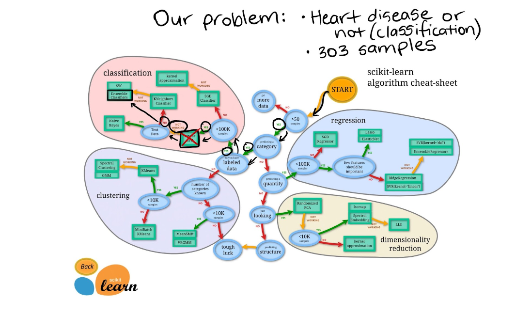
"Wait, I don't see Logistic Regression and why not use LinearSVC?"
Good questions.
I was confused too when I didn't see Logistic Regression listed as well because when you read the Scikit-Learn documentation on it, you can see it's a model for classification.
And as for LinearSVC, let's pretend we've tried it, and it doesn't work, so we're following other options in the map.
For now, knowing each of these algorithms inside and out is not essential.
Machine learning and data science is an iterative practice. These algorithms are tools in your toolbox.
In the beginning, it's more important to understand your problem (such as, classification versus regression) and then knowing what tools we can use to solve it.
Since our dataset is relatively small, we can experiment to find the algorithm performs best.
All of the algorithms in the Scikit-Learn library use the same functions, for training a model, model.fit(X_train, y_train) and for scoring a model model.score(X_test, y_test). score() returns the ratio of correct predictions (1.0 = 100% correct).
Since the algorithms we've chosen implement the same methods for fitting them to the data as well as evaluating them, let's put them in a dictionary and create a which fits and scores them.
Put models in a dictionary
models = {"KNN": KNeighborsClassifier(),
"Logistic Regression": LogisticRegression(),
"Random Forest": RandomForestClassifier(),
“SVC”: SVC()}
Create function to fit and score models
def fit_and_score(models, X_train, X_test, y_train, y_test):
"""
Fits and evaluates given machine learning models.
models : a dict of different Scikit-Learn machine learning models
X_train : training data
X_test : testing data
y_train : labels assosciated with training data
y_test : labels assosciated with test data
"""
# Random seed for reproducible results
np.random.seed(42)
# Make a list to keep model scores
model_scores = {}
# Loop through models
for name, model in models.items():
# Fit the model to the data
model.fit(X_train, y_train)
# Evaluate the model and append its score to model_scores
model_scores[name] = model.score(X_test, y_test)
return model_scores
model_scores = fit_and_score(models=models,
X_train=X_train,
X_test=X_test,
y_train=y_train,
y_test=y_test)
model_scores
{'knn': 0.4571145265245414,
'logistic regression': 0.48339117501239465,
'Random Forest': 0.5086762518591968,
'SVC': 0.5151214675260287}
Let's briefly go through each of them.
- Hyperparameter tuning - Each model you use has a series of dials you can turn to dictate how they perform. Changing these values may increase or decrease model performance.
- Feature importance - If there are a large amount of features we're using to make predictions, do some have more importance than others? For example, for predicting heart disease, which is more important, sex or age?
- Confusion matrix - Compares the predicted values with the true values in a tabular way, if 100% correct, all values in the matrix will be top left to bottom right (diagnol line).
- Cross-validation - Splits your dataset into multiple parts and train and tests your model on each part and evaluates performance as an average.
- Precision - Proportion of true positives over total number of samples. Higher precision leads to less false positives.
- Recall - Proportion of true positives over total number of true positives and false negatives. Higher recall leads to less false negatives.
- F1 score - Combines precision and recall into one metric. 1 is best, 0 is worst.
- Classification report - Sklearn has a built-in function called classification_report() which returns some of the main classification metrics such as precision, recall and f1-score.
- ROC Curve - Receiver Operating Characterisitc is a plot of true positive rate versus false positive rate.
- Area Under Curve (AUC) - The area underneath the ROC curve. A perfect model achieves a score of 1.0.
For Second Part click here
For Third Part Click here
References:
Written by ankit Mandal