Exploratory Data Analysis

In the previous article, we explored the different data preprocessing steps using the Auto MPG dataset. In this article, we will be looking at exploratory data analysis and the different methods.
Exploratory Data Analysis is used to analyze and investigate datasets and summarize their main characteristics, often employing data visualization methods. In order to gain insights and develop hypotheses, it involves analyzing and summarizing the key features, trends, and correlations in the data.
Outlier: an outlier is an object that deviates significantly from the rest of the object. We can visualize the deviation using a boxplot.
plt.figure(figsize=(20,10))
sns.boxplot(x='Cylinders',y='MPG',data=data_df)
plt.show()

Outliers can affect the data normalization and scaling of data. By removing outliers, we can obtain a more accurate representation of the data and reduce the chances of errors. The below code helps in removing outliers.
Q1 = data_df.quantile(.25)
Q3 = data_df.quantile(.75)
IQR = Q3-Q1
data_df = data_df[~((data_df<(Q1-1.5*IQR)) | (data_df(Q3+1.5*IQR))).any(axis=1)]
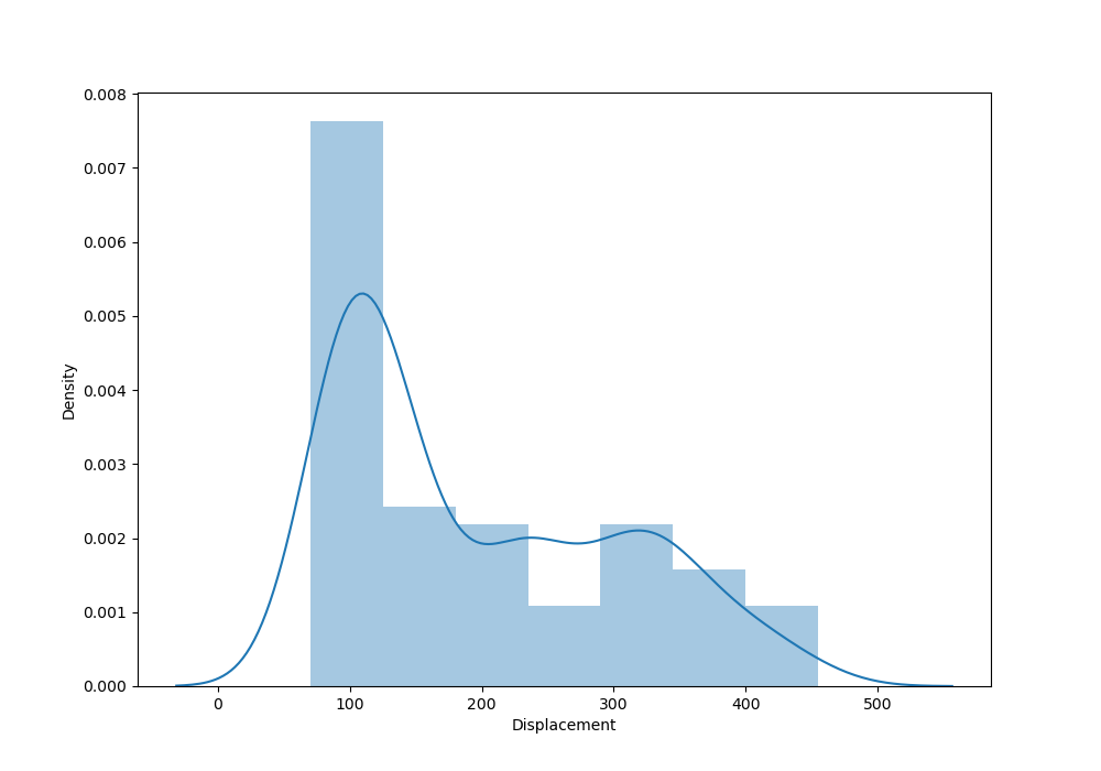
Visualizing data using KDE plot: creating a KDE plot helps in visualizing the distribution of the variables. It provides insights into the variable’s density and identifies any outliers.
data_df.Displacement.plot(kind='kde')
plt.show()

Histogram: it provides a visual representation of the data distribution and characteristics of variables and helps understand tendencies and patterns.
plt.figure(figsize=(6,6))
sns.histplot(data_df.Displacement)
plt.show()

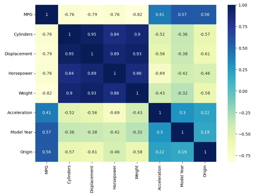
Heatmap: it uses color-coded cells to visualize the strength of relationship between two variables in the dataset.
plt.figure(figsize=(8,6))
sns.heatmap(data_df.corr(),annot=True, cmap='Y1GnBu')
plt.show()
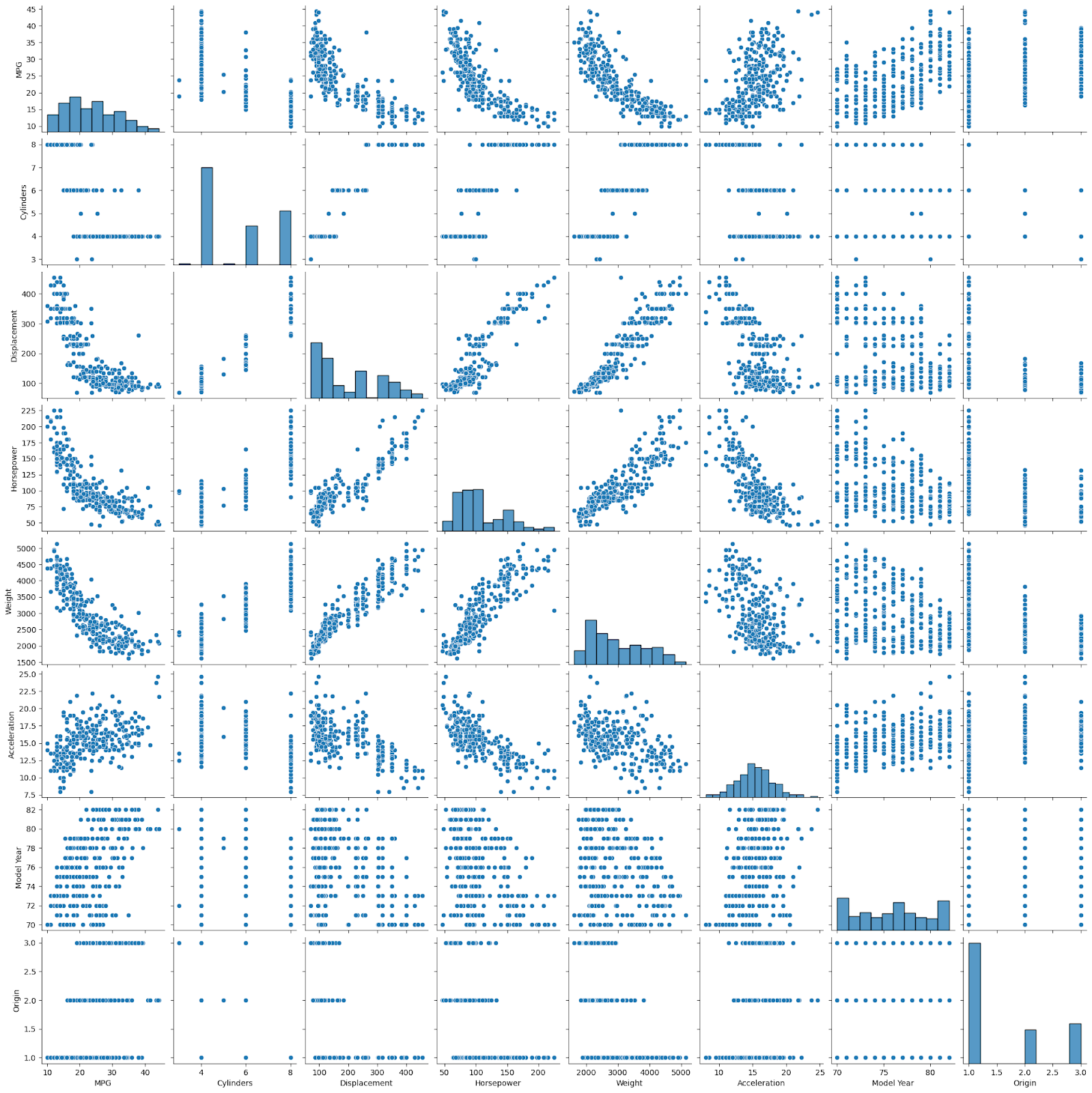
Pairplot: it helps plot pairwise relationships between the variables within the dataset using the seaborn library.
df = data_df.sample(300)
sns.pairplot(df)
plt.show()
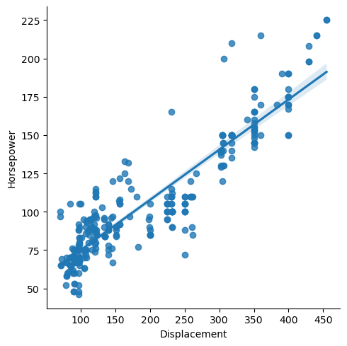
LMplot: it is used for visualizing linear relationships between variables using scatter plots with fitted regression lines across a FacetGrid.
plt.figure(figsize=(8,6))
sns.lmplot(x='Displacement',y='Horsepower',data=df)
plt.show()
Distplot: it is a combination of KDE plot and histplot
plt.figure(figsize=(10,7))
sns.distplot(df.Displacement)
plt.show()
Jointplot: it combines scatter plots, KDEplot, histplot, and regression analysis into one graph, providing a comprehensive overview of the data.
plt.figure(figsize=(10,7))
sns.jointplot(x='Horsepower',y='Displacement',data=df)
plt.show()

References:
https://www.geeksforgeeks.org/types-of-outliers-in-data-mining/
By Arushi Paliwal