Partial Dependence Plots in Structured Classification
Interpreting machine learning models can be defined as a process of identifying the different characteristics of that particular model. The main reason for interpreting/explaining the machine learning model is that the user wants to know how the model works and has trust issues.
There are several interpretability techniques, which can be applied in different circumstances. One of them is Understanding model mechanism or model visualization. In this article, we will discuss the model visualization technique.
Model Visualization
Model visualization techniques are used to understand how a particular model can make predictions. In simple words, they explain how the model works or how the model makes decisions. One of the Model Visualization techniques is listed below:
- PDP(Partial dependence plots)
Partial Dependence Plots
It is a model agnostic and global explainability technique. To know what is model agnostic and model-specific techniques please visit this link. Partial dependence shows how a particular feature affects a prediction. By making all other features constant, we want to find out how the feature in question influences our outcome. Partial dependence plots are the plots of prediction probabilities of the classification plotted against the changes in the values of a feature. The values are the mean of various test cases.
As an example, we are taking this Heart stroke dataset. This dataset consists of data on heart disease patients and the prediction which we need to do is whether a patient has a risk of heart stroke or not based on other features. Let's jump to the coding part.
Importing the necessary packages.
import os
import numpy as np
import pandas as pd
import matplotlib.pyplot as plt
import seaborn as sn
import sklearn
from sklearn.model_selection import train_test_split
import sklearn.ensemble
Reading the data.
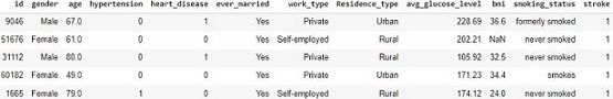
data = pd.read_csv('/content/healthcare-stroke-data.csv')
data.head()
Preprocessing: Doing the preprocessing steps such as imputation of null values, removing unnecessary columns which do not have a part in prediction, label encoding the columns i,e. converts the labels into the numeric form so as to convert them into machine-readable form.
data.isnull().sum()
data['bmi']=data['bmi'].fillna(data['bmi'].median())
data = data.drop(columns = 'id')
from sklearn.preprocessing import LabelEncoder
label_encoder = LabelEncoder()
for i in data.columns:
    data[i]=label_encoder.fit_transform(data[i])
After converting all the categorical columns to numerical format now we have to split the data into training and testing.
x = data.drop(columns = 'stroke')
y = data['stroke']
train, test, labels_train, labels_test = sklearn.model_selection.train_test_split(x , y, train_size=0.80)
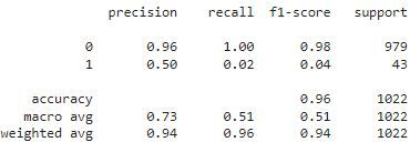
Building Model: Building the random forest classifier on the training data and doing prediction on test data.
rf = sklearn.ensemble.RandomForestClassifier()
rf.fit(train, labels_train)
from sklearn.metrics import classification_report,accuracy_score
test_preds = rf.predict(test)
test_accuracy = classification_report(labels_test,test_preds)
print(accuracy_score(labels_test, test_preds))
The next step is to install PDP and view how our model works. The below command helps to install PDP. Now we can know why our model works in a particular way and how they are predicted.
!pip install pdpbox
features=data.columns.values
features1 = features.tolist()
features1.remove('stroke')
# Use Pdpbox
%matplotlib inline
import matplotlib.pyplot as plt
from pdpbox import pdp
from pdpbox.pdp import pdp_isolate,pdp_plot
for x in features1:
    feature_to_plot=x
    pdp_dist = pdp_isolate(model=rf, dataset=test, model_features=features1, feature=feature_to_plot)
    pdp.pdp_plot(pdp_dist, feature_to_plot)
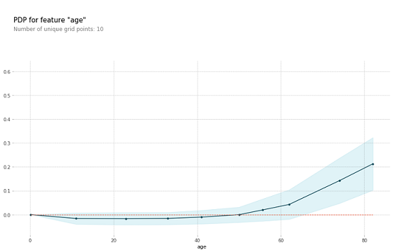
The plot above shows the partial dependence plot for the feature age. The target variable we are trying to predict is the occurrence of heart stroke. As we can see in the above graph if the age is greater than 50 years the probability of getting the stroke to a person is high. When thinking about this insight intuitively, the model makes sense and we are more likely to trust its predictions.
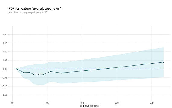
The above graph is for another column avg_glucose_level. Here we can see that if the value of the average glucose level is greater than 190 then the risk of getting a heart stroke is high.
Conclusion
We saw how we can explain the machine learning model and be able to understand how our model works and why our model is being predicted in a particular way. This way any user can easily understand and trust its predictions and can be used in a long run.
References
- https://christophm.github.io/interpretable-ml-book/pdp.html
- https://towardsdatascience.com/explain-machine-learning-models-partial-dependence-ce6b9923034f
- https://www.kaggle.com/datasets/fedesoriano/stroke-prediction-dataset