EFFECTIVE STYLING IN TAILWIND CSS
INTRODUCTION:
- With the aid of the well-liked utility-first CSS framework Tailwind CSS, programmers can easily create user interfaces that are both responsive and scalable.
- Instead of creating bespoke CSS, as is the case with standard CSS frameworks, Tailwind CSS focuses on offering a complete collection of utility classes that can be immediately applied to HTML elements.
- In this article, we'll examine the main benefits and features of Tailwind CSS, as well as offer usage examples.
KEY FEATURES:
Utility-First Approach:
- Tailwind CSS has a utility-first strategy and offers a large number of compact, single-purpose utility classes that may be combined to style elements.
- This strategy promotes reusability and does away with the need to create bespoke CSS classes.
Responsive Design Tools:
- Tailwind CSS has built-in responsive design tools that make it simple for developers to make responsive layouts.
- You may use responsive classes like ‘sm:’, ‘md:’, and ‘lg:’, to apply various styles according to screen sizes.
Customisation Possibilities:
- Tailwind CSS offers a wide range of customisation possibilities. Using configuration files, developers may change the default theme, add or delete utility classes, and construct their own utility classes.
- Because of its adaptability, Tailwind CSS may be customised to meet the needs of certain projects.
ILLUSTRATION:
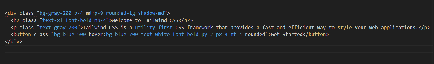
We make use of a number of Tailwind CSS's utility classes in the example above. Here is a breakdown of the applied classes:
- `bg-gray-200`: Sets the background color of the container to a light gray (#E5E7EB).
- `p-4 md:p-8': Sets the padding of 4 units for small screens and 8 units for medium screens
- and above.
- `rounded-1g`: Applies rounded corners to the container.
- `shadow-md`: Adds a subtle box shadow to create a card-like effect.
- `text-xl`: Sets the font size to extra-large.
- `font-bold`: Applies bold font weight.
- `mb-4`: Adds margin-bottom of 4 units.
- 'text-gray-700`: Sets the text color to a medium gray (#4B5563).
- 'bg-blue-500` hover:bg-blue-700`: Specifies the background color of the button and
changes it to a darker shade when hovered.
- `text-white`: Sets the color to white
- `py-2 px-4`: states vertical & Horizontal padding of 2 units
- `mt-4`: Generates margin-top of 4 units
- `rounded`: Generates rounded corners to the button
Without coding any unique CSS, we may style the card component using these utility classes. Developers may quickly construct and alter a variety of UI components by mixing and modifying these classes.
TAILWIND CSS FEATURES:
The TAILWIND CSS Mainly focuses on the Styling of the website with certain methods and functions:
- SIZING
- COLORS
- TYPOGRAPHY
- SHADOWS
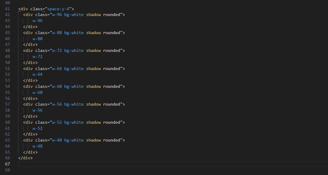
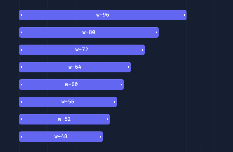
SIZING:
The TAILWIND CSS Styling primarily goes with the sizing of the Sizes with different formats and initials.
ILLUSTRATION:
This Generated OUTPUT:
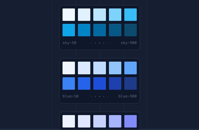
COLORS:
The TAILWIND CSS Coloring primarily goes with the coloring of the styles with different colors and formats.
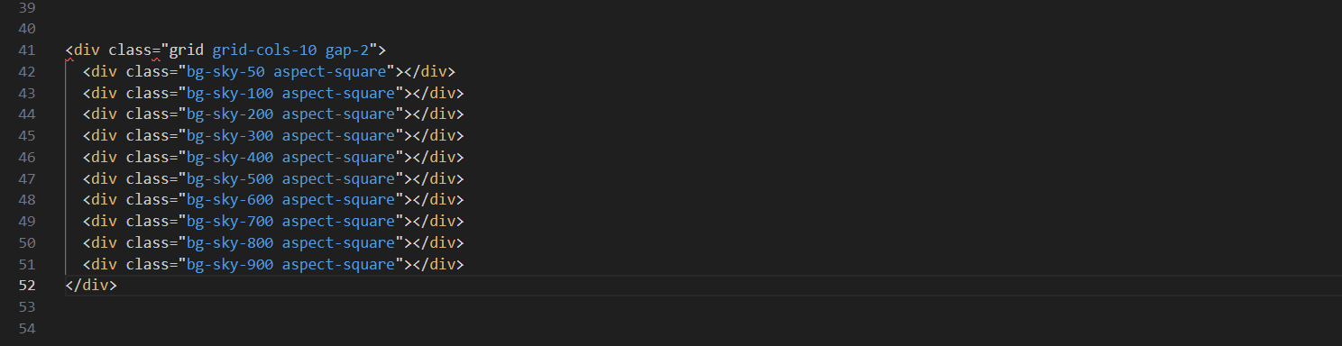
The Generated OUTPUT:
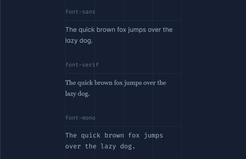
TYPOGRAPHY:
The TAIL WIND CSS Typography primarily goes with the Type Format of the styles with different Typing styles & Fonts, and Formats.
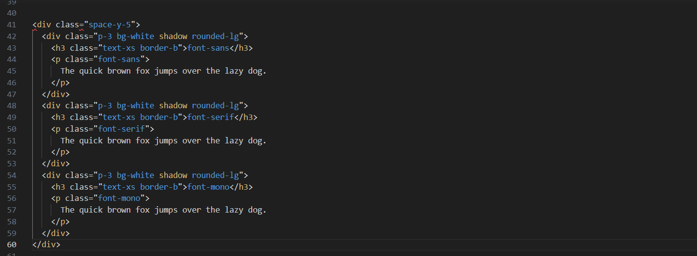
The Generated OUTPUT:
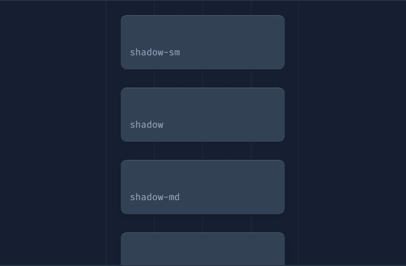
SHADOWS:
The TAILWIND CSS Shadows primarily go with the Text bg shadows of the styles with different Typing styles & Fonts, and Formats.
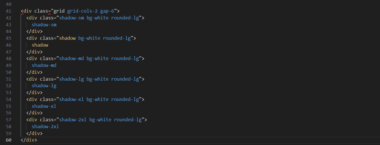
The Generated OUTPUT:
CONCLUSION:
- A potent utility-first approach to web application style is provided by Tailwind CSS.
- Developers may quickly create cutting-edge applications because to its vast collection of utility classes, responsiveness support, and simple customization choices.
REFERENCES:
https://www.geeksforgeeks.org/introduction-to-tailwind-css/
By
Kolli Naga Sai Venkata Rohit
Shiva Kumar