Individual Conditional Expectation(ICE) in Structured Classification

In the previous article, we discussed partial dependence plots and their working. In this article, we will discuss Individual Conditional Expectation(ICE). Similar to Partial Dependence Plots, Individual Conditional Expectation is also a model visualization technique.
Drawbacks of Partial Dependence Plots
Before jumping into the ICE let us discuss the problem with partial dependence plots. A partial dependence plot or PD plot only shows the marginal effects. To explain more precisely let us take an example if some of the data points of a particular feature are having a positive association with the prediction while some other data points of a particular feature are having a negative association with the prediction.
The partial dependence plot shows a horizontal line because it takes both positive and negative predictions and calculates the mean of both the test cases and then plots a PD plot. By plotting the graph like this we are concluding that a particular feature has no effect on the prediction. Because of this drawback, we are now using Individual Conditional Expectation(ICE) since it can show heterogeneous effects instead of showing an aggregated line or flat line.
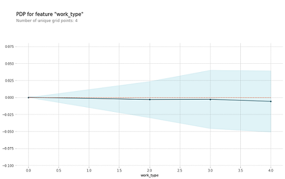
As we can see the below graph is an example of how a PD plot can be shown in an aggregated line and this concludes that the feature work_type has no effect on the prediction. The dataset taken to show this graph is the heart stroke dataset.
Individual Conditional Expectation
It is a model agnostic and local explainability technique. To know what is model agnostic and model-specific techniques please visit this link. Unlike PD plots, ICE shows the display of one line for each instance. By this, we can see how the instance's prediction changes when a feature changes. Also, this way we can see which instance is having a positive effect on the prediction and which instance is having a negative effect on the prediction.
As an example, we are taking this Heart stroke dataset. This dataset consists of data on heart disease patients and the prediction which we need to do is whether a patient has a risk of heart stroke or not based on other features. Let's jump to the coding part.
Please check the sklearn version you are having before importing the packages or installing any libraries. To check the version of sklearn in google collaboratory.
#To check the sklearn version
import sklearn
sklearn.__version__
And if you are not having the sklearn version == 0.24.1. Please install this version.
!pip install scikit-learn==0.24.1
To import the necessary packages, installation of libraries, preprocessing and building of the model please refer to this link as in that link also I am using the same dataset. So now I am showing the coding part of the ICE only.
!pip install pdpbox
features=data.columns.values
features1 = features.tolist()
features1.remove('stroke')
%matplotlib inline
import matplotlib.pyplot as plt
from pdpbox import pdp
from pdpbox.pdp import pdp_isolate,pdp_plot
def plot_pdp(model, df, feature, cluster_flag=False, nb_clusters=None, lines_flag=False):

    # Create the data that we will plot
    pdp_goals = pdp.pdp_isolate(model=model, dataset=df, model_features=df.columns.tolist(), feature=feature)

    # plot it
    pdp.pdp_plot(pdp_goals, feature, cluster=cluster_flag, n_cluster_centers=nb_clusters, plot_lines=lines_flag)
    plt.show()
for x in features1:
    plot_pdp(rf, test, x, cluster_flag=True, nb_clusters=10, lines_flag=True)
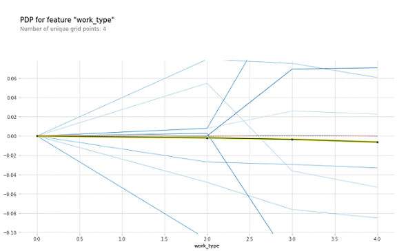
In Fig2 the blue lines represent each instance and the thick line in the center is the PDP line. When comparing Fig1 and Fig2 we can see how PDP and ICE are different. PDP shows the aggregate value of the plot whereas ICE shows the instances and their predictions. Fig1 and Fig2 are examples of drawbacks of PDP and the advantages of ICE over PDP.
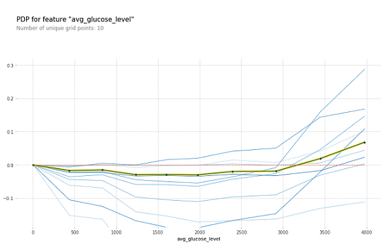
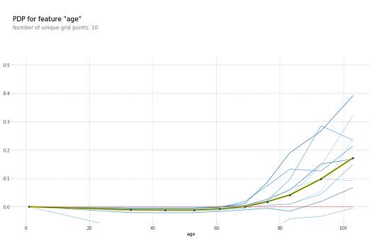
These are some of the graphs where Fig3 represents for avg_glucose_level feature and Fig4 represents for age feature. Where these two features of PDP plots are there in the previous article. When you compare those two graphs and these two graphs you can see how PDP is only showing the aggregated line whereas ICE is showing different blue lines for the instances.
Disadvantages
The thing is if there are so many instances and if we want to see all of them in ICE then the graph will be clumsy and we cannot see all the instances as some of them are underlying below some instances. So to resolve this problem we need to remove some of the lines i,e. instances and we have to show only some of them. In the above graphs also I have taken only 10 lines for better visualization purposes.
References
- https://www.kaggle.com/datasets/fedesoriano/stroke-prediction-dataset
- https://christophm.github.io/interpretable-ml-book/ice.html