Model Explainability using SHAP for Regression Problems

Nowadays we are able to solve various problems using AI. We have built a model that can predict the price of a house in an area, a model which can predict the team that is most likely to win the IPL using data, and predict who will qualify for NFL playoffs. In this blog, we are looking at SHAP for regression.
But will any person looking to buy a house trust your 90% + accuracy model or would a person betting for a tournament trust your model no matter how accurate it is.
No, they won't. No one would trust an AI model just because it was almost right every time. The reason is simple these are all Black Box. We can see the input and the resultant output but not what happens in between.
This is where you can see the importance of Model Explainability. Using techniques like LIME, ALE, SHAP, ICE, etc. we can explain why the model came up with the value.
One such explainability technique is SHAP (SHapley Additive exPlanations) which we are going to be covering in this blog.
SHAP (SHapley Additive exPlanations)
SHAP or SHAPley Additive exPlanations is a visualization tool that can be used for making a machine learning model more explainable by visualizing its output. It can be used for explaining the prediction of any model by computing the contribution of each feature to the prediction. It is a combination of various tools like lime, SHAPely sampling values, DeepLift, QII, and many more.
One of the main components of the SHAP tool is SHAPley values because using it, SHAP connects optimal credit allocation with local explanations. When we talk about the SHAPley values we can consider them as a method that can tell how to accurately distribute the contribution by the features, among the features.
Let's look at the code of SHAP.
# Importing the required libraries

import numpy as np
import pandas as pd
import matplotlib.pyplot as plt
from sklearn.model_selection import train_test_split
from sklearn.ensemble import RandomForestRegressor
from sklearn.metrics import mean_squared_error
Importing the required libraries
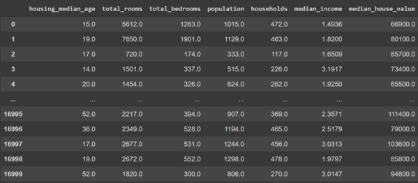
# Reading the dataset

df = pd.read_csv("/content/sample_data/california_housing_train.csv")
Loading and reading the dataset.
Now let's go ahead and split the dataset and train a random forest model.
# Defining the dependent and the independent features

X = df.iloc[:,:-1]
Y = df.iloc[:,-1]

# Splitting the data set in train and test

X_train, X_test, Y_train, Y_test = train_test_split(X, Y, test_size = 0.3, random_state = 0)

# Training a Random Forest model

rfr = RandomForestRegressor()
rfr.fit(X_train,Y_train)
Y_pred = rfr.predict(X_test)

# Printing the Mean Squared Error

print(mean_squared_error(Y_test,Y_pred,squared=False))
Now that we are done building the model our next step is to install SHAP
!pip install shap
Since we have a Tree-based model we will be needing the Tree explainer for the explanations.
shap_values = shap.TreeExplainer(rfr).shap_values(X_test, check_additivity = False)
shap.summary_plot(shap_values, X_test, feature_names=X.columns)
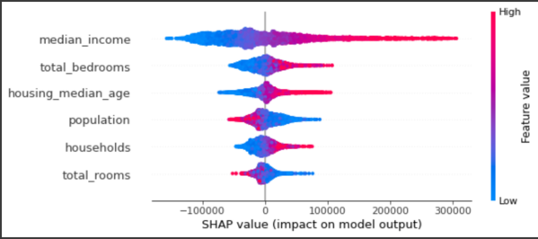
The summary plot combines feature importance with feature effects. Each point on the summary plot is a Shapley value of an instance per feature. The position on the y-axis is determined by the feature and on the x-axis by the Shapley value of each instance. We can see that the feature median_income is the most important feature and has a high Shapley value range. The color represents the value of the feature from low to high. The features are ordered according to their importance.
Summary
In the end, we can see that other than just showing the loss of a model in the case of regression models using SHAP we can visualize the features that are important and thus explain the behavior of the model.
References
- https://towardsdatascience.com/explainable-ai-xai-with-shap-regression-problem-b2d63fdca670
- https://shap.readthedocs.io/en/latest/index.html
- https://www.kaggle.com/datasets/camnugent/california-housing-prices
Want to know more ?
You want to see how SHAP can be used in Text or Audio. You can check out how LIME would be possible on Image or Text.
AIensured offers a variety of solutions like Explainability, Fairness/bias evaluation. For these solutions, you can refer to this - Link